Sydney Sweeney Color Analysis: what’s her palette?
- Michele Trancoso
- Jan 16
- 4 min read


Sydney Sweeney’s personal color analysis is one of those topics that always sparks debate — and I totally understand why.
She often appears with:
golden, highlighted hair
peachy/bronzed makeup
warm and vibrant looks
a sun-kissed glow
And that makes many people think:
“She’s definitely warm!”
But professional personal color analysis isn’t defined by intuition — or by hair color, tanning, or makeup preferences.
📌 Color analysis is based on how the face reacts to colors (light-color response).In other words: the color near the face reveals everything.
So today, we’re starting the year with a wonderful post: a complete Sydney Sweeney analysis using my 3-step method.
✅ Step 1 — Temperature (cool vs warm)
✅ Step 2 — Depth (light vs deep)
✅ Step 3 — Saturation (soft vs bright)
And the best part: using real photos of her for comparison.
How I analyze personal color (my method)
I always follow one very clear principle:
📌 there’s no such thing as “absolute neutral.”You are either cool undertone or warm undertone.
At each step, I eliminate possibilities until the final palette is consistent and clear.
✅ STEP 1 — Temperature: COOL or WARM?

Here I observed Sydney in:
cool tones (silver, cool pink lipstick, cooler looks)
warm tones (yellow, orange-red, warm pink lipstick)
What I look for in cool undertones:
✅ skin looks more even
✅ eyes stand out
✅ natural harmony, no effort
What I look for in warm undertones:
✅ skin comes alive with golden tones
✅ face looks healthier/warmer
✅ warmth doesn’t create shadows or heaviness
📌 Sydney’s result:In cooler and rosier tones, she keeps her face delicate and harmonious.When the look shifts too much to warm/orange, the color shows up before her face.
➡️ Step 1 conclusion: Sydney suits COOL undertone.
✅ STEP 2 — Depth: LIGHT or DEEP?
Now comes a step that is very clear in her case: depth/contrast.
The question:
Can she handle dense, deep darks… or do dark colors overpower her face?

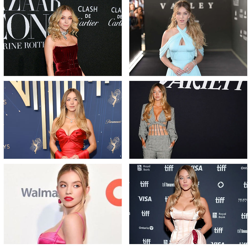
For this, I compared 6 photos:
✅ 3 dark/heavy tests
✅ 3 light/soft tests
🔻 Group A — Dark/heavy tests (3 photos)
Photo 1 — Black hair
Black creates a strong frame and increases contrast.
✅ What happens:
black dominates
face loses luminosity
overall image feels heavier
➡️ clear sign she is not deep.
Photo 2 — Dark green dress
A dense, deep color.
✅ On her:
the outfit arrives before the face
skin seems to ask for compensation
it reads more serious than elegant
➡️ another sign that darks overpower her.
Photo 3 — Light hair + heavy makeup (high contrast)
Makeup creates artificial depth.
✅ On her:
the look feels more “constructed”
she loses delicacy
heaviness increases
➡️ high contrast isn’t natural on her.
✅ Group A result: dark shades steal the spotlight from her face.
🔺 Group B — Light/soft tests (3 photos)
Photo 4 — Very light hair + soft makeup
This is where she shines.
✅ Effect:
more even skin
eyes stand out
freshness and elegance
Photo 5 — White dress
A classic test.
✅ On her:
it doesn’t wash her out
it brightens
effortless harmony
Photo 6 — Very light makeup
Golden rule:
if removing weight makes her prettier → she is light
✅ On her:
her face breathes
skin looks finer
sophisticated without exaggeration
✅ Group B result: the lighter, the better.
➡️ Step 2 conclusion: Sydney is LIGHT (not deep).
✅ STEP 3 — Saturation: BRIGHT or SOFT?
Now the final step: saturation.
The question:
Do vibrant colors enhance her — or compete with her face?
I compared 6 photos:
✅ 3 saturated looks
✅ 3 muted/soft looks
🔻 Group A — Saturated (burgundy, red, fuchsia)
Photo 1 — Burgundy dress (saturated)
✅ On her:
color arrives before the face
skin asks for more makeup/contrast
feels heavy
Photo 2 — Red dress (saturated)
✅ On her:
the dress dominates
facial delicacy decreases
reads more “done” than natural
Photo 3 — Fuchsia dress (saturated)
✅ On her:
color competes with the face
harmony becomes less natural
✅ Saturated group result: colors dominate her.
🔺 Group B — Muted/soft (light blue, gray jumpsuit, soft pink)
Photo 4 — Light blue dress (soft)
✅ On her:
face comes first
natural elegance
freshness
Photo 5 — Gray jumpsuit (low saturation)
(this is a saturation test, not undertone)
✅ On her:
doesn’t compete
clean and sophisticated
Photo 6 — Soft pink dress
✅ On her:
skin looks finer
eyes appear brighter
natural harmony
✅ Muted group result: the softer, the better.
➡️ Step 3 conclusion: Sydney suits SOFT / MUTED colors.
✅ FINAL CONCLUSION — What is Sydney Sweeney’s palette?
Putting all three steps together:
✅ Temperature: COOL
✅ Depth: LIGHT✅
Saturation: SOFT
🎯 This closes her season as:
LIGHT SUMMER (cool, light, and soft)
That’s why she looks stunning in:
soft cool pink
light blue
lavender
pearl tones
light grays
delicate rosy makeup
While very bright or dark tones:
dominate
make the image heavier
compete with her natural delicacy
Want to find your palette with confidence?
If you want to stop doubting:
which colors truly flatter you
which ones wash you out
which makeup/hair colors harmonize with you
👉 then you need a complete and technical analysis.
✨ On my blog I explain everything in detail, and in consultation I apply the method directly to you.
📌 Want your personal color analysis with me?


Comments